
Canvas: Design an Accessible and Usable Course Site
Instructors can create course sites that are both usable and accessible to the widest range of students possible by organizing their course site with a landing page, modules, and a limited menu, plus following other core skills of accessible design.
Challenge
Instructors must ensure all students have access to their instructional materials according to University policy, including students with disabilities. Ensuring accessibility may seem overwhelming, especially as you are creating digital course materials and Canvas sites.
Solution
But you can start small by following the good practices outlined below, and applying the seven core skills of digital accessibility to your course.
As a plus, these practices also enhance usability for all students.
+
Create a Landing Page
The home page is the entry point for any Canvas course. That is, it’s the first thing students see when they go to your course website. While you can set the home page to display any type of Canvas activity (e.g., activity stream, assignment list, syllabus, page), the most accessible option is to create a landing page.
- A landing page can help orient the student to the way you have your site laid out.
- It should show your students where they are “located” in the architecture of the course and what actions are available to them.
- Your design should work well as a landing page both for first-time Canvas users and throughout a full semester, as your students will visit this home page every time they come to the course website.
Example
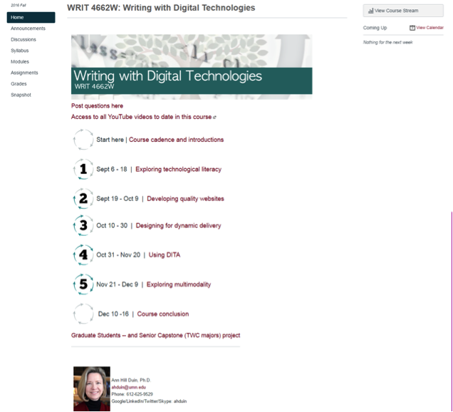
The Canvas landing page pictured below is effective because it:
- welcomes student to the site,
- offers support for students new to Canvas, and
- tells students what to do next.
+
Limit Items in the Course Menu
While you as an instructor can see all the types of activities available to you in the Course Menu in the left column of Canvas sites, you should limit the number of activity types that students can see. Reduce your Course Menu to include only the tools you are using in your course, to mitigate visual overwhelm.
Example
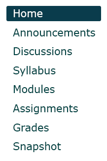
You might have heard that menu items should be limited to "seven plus or minus two," to match the number of items people can keep in their short term memory, but you can create longer menus "as long as the options are structured in a meaningful way".
+
Use the Module Layout to Arrange Course Materials
The module layout is the most accessible way to arrange course materials on your course website.
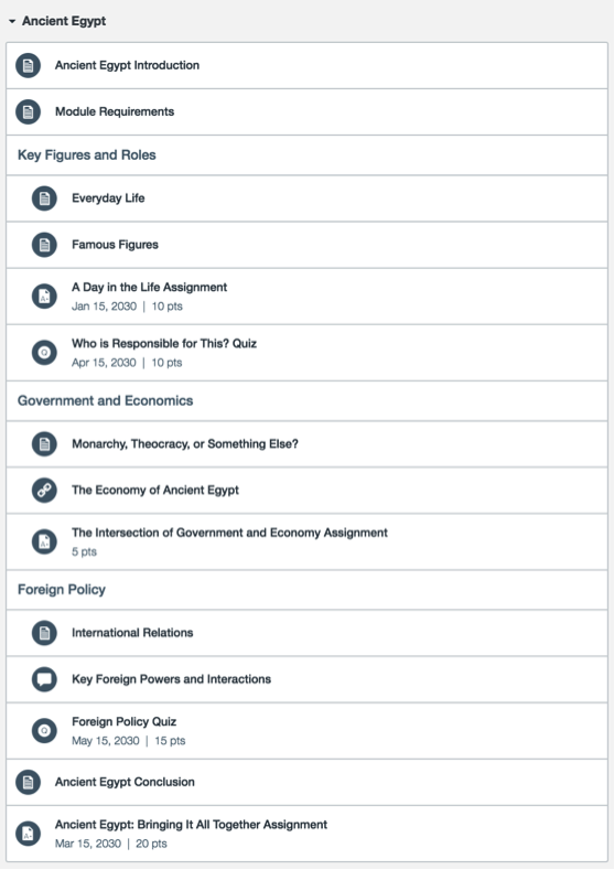
A well-organized Canvas module includes:
- A page introduction ("Ancient Egypt Introduction" in the screenshot below)
- Headings that group sections of content into digestible chunks
- Due dates and point values (both displayed automatically in the module view, wherever you’ve entered this information)
Example
Arrange Module Materials
The module format has accessible navigation by default. However, you will need to do some additional organization and planning to make the module more usable and cohesive across all the modules in your course site.
- Begin each module with a page that introduces students to the topic, lets them know what to expect, and provides guidance for proceeding.
- Create descriptive titles for all activities. Students should be able to tell exactly what the activity is about without having to click into it first. They should also be able to scan the contents of the module and get an overview of the topic just from the descriptive titles.
- Define and group content using text labels.
- Use indenting to clearly define the hierarchy of the content.
- Add due dates and point values for each assignment and activity. Canvas automatically displays them on the module overview.
Include Links to Modules on the Landing Page
The downside to Canvas navigation is that it’s possible to navigate a whole Canvas course without ever seeing the module overview that you’ve so carefully put together. For instance, students might click the Assignments link from the Course Menu and just complete the assignments they see listed there.
To combat this, make sure it’s clear on your Canvas landing page how to get to each of the modules on your site.
+
Structure Content Pages
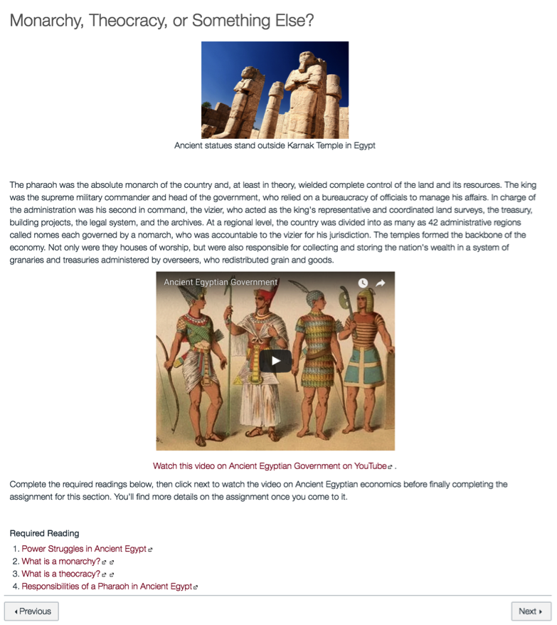
A well-organized, usable and accessible content page has:
- Meaningful images with alternative text for screen reader users
- Foreground and background colors in text and graphics that strongly contrast each other
- Clear headings appropriately formatted hierarchically
- Links that are concise, descriptive, and meaningful out of context
- Key concepts presented as lists where possible
- Simple tables with clearly identified header rows
- Videos with accurate captions and audio descriptions
Learn more on the Accessible U website Start with the 7 Core Skills page.
Example
+
Review Content
UDOIT (Universal Design Online Content Inspection Tool) identifies accessibility issues in Canvas course content and provides resources on how to address common accessibility issues. UDOIT is enabled for every course at the University of Minnesota. The Check Accessibility with UDOIT can be found on the left navigation menu.
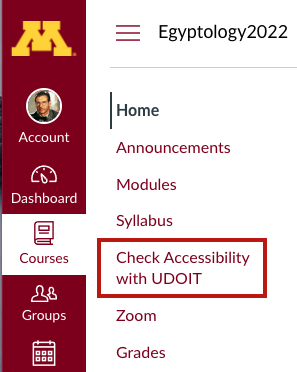
When you navigate to this area, you are provided with full details of all the updates.
Intended Audiences
Do-It-Yourself Resources
Self-Help Guides
This self-help guide takes you through the basic process of building a Canvas course site from the ground up, starting with creating and linking content, building assessments, and choosing final course settings.
This self-help guide takes you through the basic process of building a Canvas course site from the ground up.
Our team of academic technologists, video and media producers, instructional designers, and project managers can help faculty and instructors select proven technologies and develop media that fit your goals and help enhance the student learning experience.