
There are two options for creating forms in WorkflowGen.
Use the Form Designer
The form designer is a WYSIWYG tool built into WorkflowGen that enables developers to drag and drop form fields, making it quick and easy to create web forms for WorkflowGen. It also comes with two built-in themes for the University of Minnesota. Get more information about using the form designer.
Manually Program Forms with Visual Studio
Manually programming forms allows more flexibility than the form designer; you can design any layout and add integrations you require. However, because manually programming the forms requires junior level developer skills, OIT recommends using the form designer unless more flexibility is needed.
The form is the means by which participants interact with the workflow. There is one form for the entire process and at different stages in the process, different participants may be granted different rights for editing and viewing the form.
There are a number of built-in fields and sections available. In addition, if you create a field and/or section that will be helpful for others or that you need to use over again, you can add it to the tool list. Any field added to the list is available to all process managers and administrators of the system.
Please note: There is no "undo" function, so it is recommended to save the form frequently. 
- To access the form editor, click "Form."

- For the requester, begin with using the Request section:
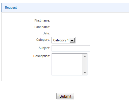
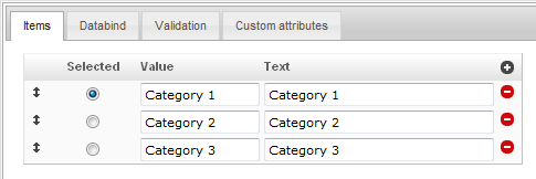
- To configure fields, hover over an individual field, then click on the pencil icon when it appears. For example, if you hover over the category field and click the pencil icon, you see this screen:
- To configure fields, hover over an individual field, then click on the pencil icon when it appears. For example, if you hover over the category field and click the pencil icon, you see this screen:
- Under the Items tab, enter names for the values that you want to appear in the drop down menu.
- If you want an item to be pre-selected, make sure the radio button for "Selected" is filled in--this is the default setting.
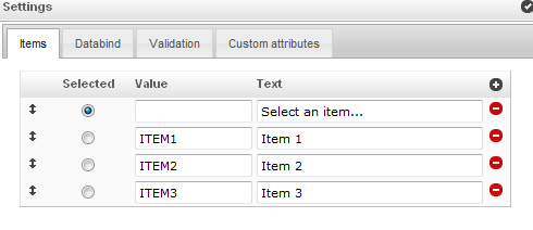
- To enable participants to choose from the drop down menu, ensure that the radio button "Selected" is not filled in. An example is shown below.
Example of an Item List
In the example screenshot above, the form is directing a participant to "select an item" and is providing the items for the participant to select.
- The first Value field is left blank.
- The text, Select an item... is entered into the Text field.
- The radio button Selected is filled in.
- The items intended to be made available for selection from the drop-down list are entered in the Value fields and in the Text fields (in this example: Value is entered as ITEM1, and the Text is entered as Item 1, etc.).
- The Selected radio button is not filled in.
Result
The resulting form item will appear like this to participants: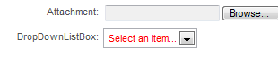
Set Up the Data Behind the Form
Additional Item Types
The Databind field enables a dynamic list to be created from a database.
Validation enables making the field required, read only, or hidden.
Field IDs
It is important to keep track of the field IDs, as WorkflowGen will use these extensively. To see the IDs click the Id button. When you turn the Ids on, the screen will look like this: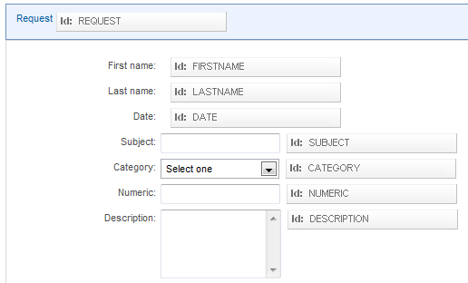
By default on form IDs, the number 1 is appended to the name, e.g, "FIRSTNAME1"
- It is a good practice to remove the 1's unless they are needed for clarity.
- The full ID that WorkflowGen uses is the section ID, then an underscore, and then the field ID.
- E.g., for the First name field, the full ID would be REQUEST_FIRSTNAME.