
In Drupal Lite, Folwell Components are configured blocks that use the Folwell design system.
Folwell Components can be added to a page either from the Edit form, or from Layout Builder. They have the same functionality, but slightly different interfaces. To see examples of the different Folwell Components, see the demo page Folwell Components Examples.
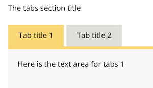
- Folwell Tabs Wrapper
- Tabs Wrappers are sometimes referred to as "responsive tabs". When a visitor clicks a tab, its content panel is displayed.
- Each tab has a panel that can contain one or more content boxes.
- A Tabs wrapper allows a lot of content to appear in a small part of the page.
- In the image below, there are two tabs (Tab title 1, Tab title 2). The tab "Tab title 1" is active, and its content box is displayed.
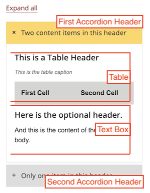
- Folwell Accordion
- Accordions are sometimes referred to as "drawers." They allow visitors to click on a header, which then expands or contracts to reveal or hide the content within a drawer. Accordions can aid in creating pages that are shorter and require less scrolling.
- Each Accordion header can contain a Table, a Text Box with optional header, or another Accordion.
- There can be multiple items in a header, and an Accordion can contain multiple headers.
- In the image below, there are two accordion headers. The first accordion header is opened, and there is a table and text box displayed. There is also an Expand All link at the top that will open all of the headers in the accordion.
- Folwell Callout
- Callouts are stylized groupings of scannable text.
- Folwell Image
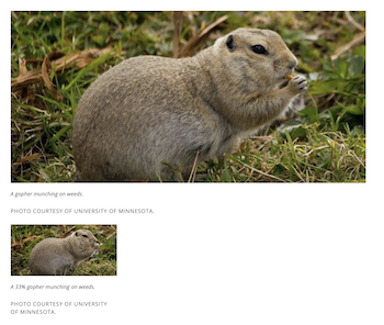
- Images add visual appeal to the content on your site, helping to grab viewer interest and attention. Common image file types are JPEG, PNG and GIF. Folwell offers four image size variations 100%, 50%, 33%, 20%.
Note: the percentages refer to the size of the image in the section region, it is not resizing the image. - The image below shows two variants, both in the same region: 100% (which fills the width of the region), and 33% (which fills 1/3 of the region)
- Images add visual appeal to the content on your site, helping to grab viewer interest and attention. Common image file types are JPEG, PNG and GIF. Folwell offers four image size variations 100%, 50%, 33%, 20%.
- Folwell Overlay Slideshow
- The Folwell Overlay Slideshow features full width photos with slide content in a gold overlay box.
- Folwell Slideshow
- The Folwell Slideshow features photos and content side by side.
- Folwell Link List
To add a Folwell Component to a page, please refer to the article Drupal Lite: Add a Folwell Component to a Page.